
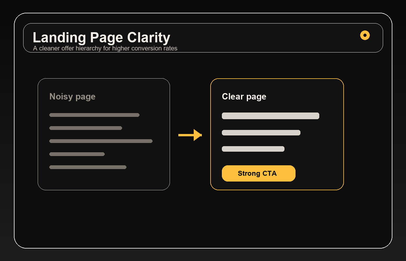
Clarity is a conversion asset
Visitors should understand the offer in seconds. The headline should match the traffic source, the subheading should define the audience and outcome, and the first call to action should be visible without competing choices.
Message match protects paid media budget
If an ad promises a specific result and the landing page opens with a generic brand statement, conversion drops. Strong CRO starts by carrying the keyword, audience pain, or creative hook into the page hierarchy.
Proof should reduce risk
Logos, testimonials, metrics, process notes, screenshots, and FAQs all have a role when they answer buyer doubt. Place proof close to the claim it supports instead of burying it at the bottom of the page.
Remove friction from the next step
Forms should ask only what sales actually needs. Buttons should use direct language. Navigation should not pull paid traffic away from the offer. Good UX makes the decision easier without making the page feel thin.
Test the story, not just the button
Button color tests rarely fix a weak offer. Test headline angles, proof order, section hierarchy, and form friction first. Those changes usually create larger conversion lifts.